 Art
Art
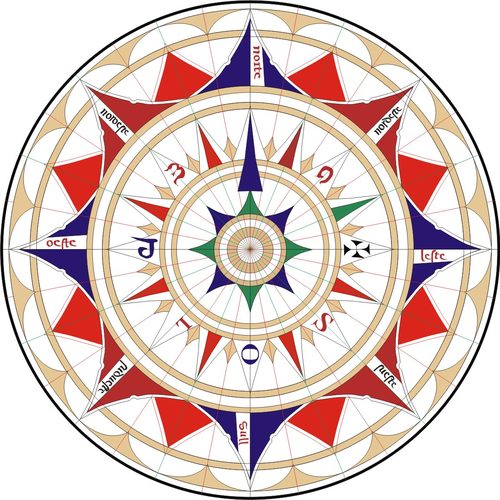
Vector illustration is a digital art form built from mathematically defined points, lines, and curves — called paths — rather than a grid of pixels, which means the artwork can be scaled to any size without losing sharpness or gaining blur. Each shape in a vector piece is made of anchor points connected by straight or curved segments, filled with flat color, gradients, or patterns, and stacked in layers that stay fully editable at any stage. Because paths are geometric rather than painted, edges stay perfectly clean and colors stay perfectly flat unless the artist deliberately adds texture. Illustrators reach for vector work because it's ideal for logos, icons, print at unpredictable sizes, and any image that needs to move seamlessly between a phone screen and a billboard. It favors a clean, graphic visual language — bold shapes, confident color, precise line — over painterly texture or soft blending, though gradient and mesh tools let it approach a more illustrative look.
How to spot it
- 01Perfectly smooth curves and edges with no visible pixelation, even zoomed in far.
- 02Flat, evenly filled color areas with crisp, hard boundaries between shapes.
- 03Simplified, geometric forms built from clean overlapping shapes rather than loose linework.
- 04Consistent line weight throughout a drawing, like a single confident pen stroke.
- 05Bold, poster-like color choices with minimal blending or painterly texture.
The Vector Illustration workshop card
days to learn tools, years for clean lineworkMaterials
- vector illustration software with a pen/bezier tool
- graphics tablet or precise mouse input
- a defined color palette or swatch library
- reusable shape and pattern libraries
- gradient and mesh fill tools
- layer and grouping panel for organization
Steps
- 1
Sketch the composition
Rough out the image as a simple raster or pencil sketch first, working out proportions and overall composition before committing to precise, final vector paths.
- 2
Set up base shapes
Build the largest, simplest forms first using basic shapes like circles and rectangles, then combine and reshape them rather than drawing every curve freehand by hand.
- 3
Draw paths with the pen tool
Place anchor points at the key turns of a curve, using as few points as possible — clean vector work uses restraint, not density, to define a smooth line.
- 4
Assign flat color fills
Fill each closed shape with a flat base color first, establishing the overall palette and value structure clearly before adding any gradients or other effects.
- 5
Layer and group shapes
Organize related shapes into clearly named groups and layers so complex illustrations stay editable and individual elements can be adjusted without disturbing anything else nearby.
- 6
Add gradients selectively
Introduce gradient fills, subtle noise texture, or shading gradients only where they truly serve the image, keeping most of the piece cleanly and consistently flat.
- 7
Refine anchor points
Go back through every path to simplify or adjust anchor points, removing redundant points and smoothing awkward curve handles for a cleaner final line overall.
- 8
Test at multiple scales
Check the illustration at both very small and very large sizes, since vector work should read clearly at any scale it's likely to be used.
Classic mistakes
Overusing anchor points
Placing too many anchor points along a curve makes paths messy and hard to edit; use the fewest points that still define a smooth line.
Relying on default gradients
Unadjusted default gradients read as flat and generic; customize gradient stops and angles to fit the specific form being shaded.
Ignoring layer organization
An unorganized stack of ungrouped shapes quickly becomes unmanageable on complex illustrations; group and name layers as the piece grows.
Copying raster habits directly
Trying to paint soft, blended shading the way you would in a raster program fights against vector's flat-shape strengths; lean into clean shapes instead.
Where it comes from
Vector illustration grew directly out of the development of vector graphics software in the 1980s, building on earlier vector-based computer graphics research, and became broadly accessible once affordable vector drawing programs reached professional design studios through the 1990s. It quickly became the standard tool for logo design, technical illustration, and any graphic needing to reproduce cleanly across wildly different sizes, from business cards to highway billboards. Through the 2000s and 2010s, vector illustration also developed as an expressive illustrative style in its own right — flat, graphic, and bold — popular in editorial illustration, branding, and animation, distinct from its original purely functional design use. Its resolution independence keeps it central to modern digital design workflows, especially anywhere print and screen sizes vary unpredictably.
See it done perfectly
| Work | Maker | Date | What to look at |
|---|---|---|---|
| Corporate logo design of the vector software era | Unknown (various design studios) | 1990s–present | Vector's resolution independence made it the standard medium for logos reproduced from business cards to billboards. |
| Flat-style editorial and app illustration | Unknown (various illustrators) | 2010s | A wave of bold, flat-color vector illustration became a dominant visual language in digital media and branding. |
| Technical and scientific vector diagrams | Unknown | 20th century onward | Vector's crisp, scalable lines made it the standard for technical illustration needing precise reproduction at any size. |
 AI-generated
Try it with AI
Get the Vector Illustration look in a generator
To push an AI image generator toward vector illustration, ask directly for 'flat vector illustration,' 'clean geometric shapes,' and 'crisp vector line art.' Specify 'flat color fills, no gradients' or 'bold flat color palette' to avoid painterly shading, and 'consistent line weight' for uniform outlines. Words like 'minimalist,' 'graphic design style,' and 'scalable icon style' reinforce the simplified, resolution-independent look. Avoid texture or brush-stroke language entirely, since those pull the image toward painting rather than clean geometric shape work.
Frequently asked questions
What is vector illustration?
Vector illustration builds images from mathematically defined points and curves rather than pixels, so artwork can scale to any size — from an icon to a billboard — without losing sharpness.
What's the difference between vector and raster art?
Raster images are made of a fixed pixel grid and lose quality when enlarged; vector images are defined by geometry and stay crisp at any size, though they suit flat, graphic looks better than painterly texture.
Do I need a tablet for vector illustration?
A mouse works fine for many vector techniques, since paths are defined by clicking anchor points rather than freehand gesture, though a tablet helps with sketching and freehand paths.
What is vector illustration best used for?
It excels at logos, icons, and any graphic that needs to reproduce cleanly at unpredictable sizes, as well as a bold, flat illustrative style popular in branding and editorial work.