 Art
Art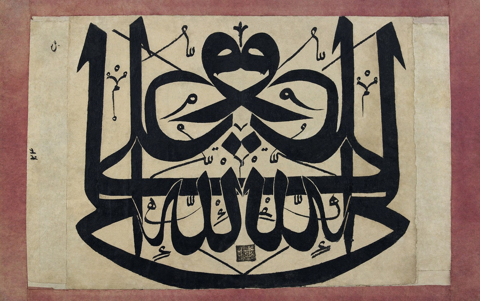
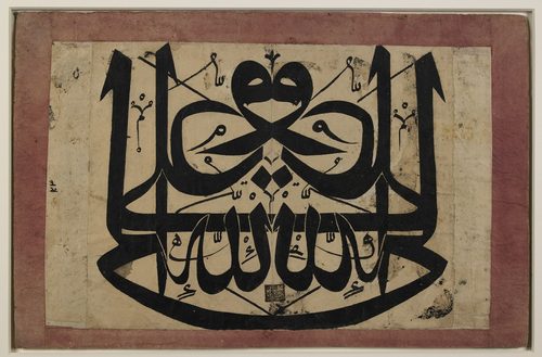
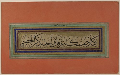
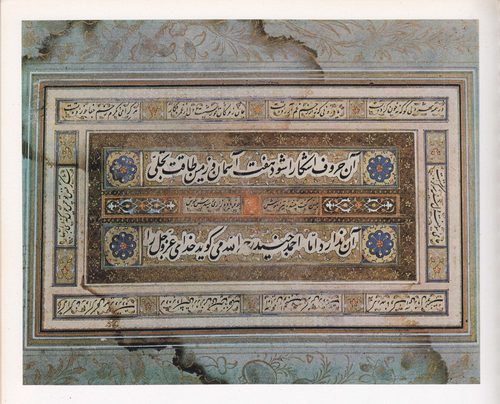
Calligraphy is the art of disciplined, expressive handwriting, where letterforms are shaped with deliberate stroke order, angle, and pressure rather than dashed off for speed. A broad-edged pen, brush, or reed held at a consistent angle produces the thick-and-thin stroke contrast that gives calligraphic letters their rhythm — thick where the tool moves with its full edge, thin where it moves against it. Traditions differ widely: Western calligraphy builds letters from geometric proportions and consistent slant, East Asian brush calligraphy treats each character as a balanced composition of controlled ink flow, and Islamic calligraphy transforms Arabic script into abstracted, often architectural pattern. Artists reach for calligraphy because it turns language itself into image — texture, spacing, and line quality carry meaning alongside the words. It remains central to manuscript work, formal documents, branding, and standalone art where the writing is the entire subject.
How to spot it
- 01Thick downstrokes and thin upstrokes from a consistently angled pen or brush.
- 02Even spacing and slant across an entire line, like a typeface drawn by hand.
- 03Ink that pools slightly at stroke ends where the tool paused.
- 04Flowing connected letters in cursive scripts, or crisp separated strokes in blackletter and brush hands.
- 05Compositions where the writing itself is the artwork, not a caption beneath one.
The Calligraphy workshop card
weeks to learn, years to refineMaterials
- broad-edged calligraphy pen or dip nib
- reed pen or bamboo brush
- India ink or sumi ink
- smooth, bleed-resistant paper
- ink well or ink stone
- ruler and light guideline sheet
- brush rest and blotting cloth
Steps
- 1
Choose your script and tool
Pick a script style — broad-edged pen for Western hands, brush for East Asian or Arabic-inspired work — and study its standard letter proportions before writing a single word.
- 2
Set up guidelines
Rule faint horizontal guidelines for x-height, ascenders, and descenders, or a grid for brush characters. Consistent guidelines are what make a whole page read as unified.
- 3
Hold the pen at an angle
Lock the pen or brush at the angle your script calls for — often around 30 to 45 degrees — and keep it constant through every stroke for even thick-thin contrast.
- 4
Drill basic strokes first
Practice straight downstrokes, curves, and joins repeatedly before attempting full letters. Muscle memory for the stroke, not the letter, is what makes handwriting look truly calligraphic.
- 5
Build letters stroke by stroke
Write each letter as a sequence of separate, deliberate strokes rather than one continuous scribble, lifting the tool between strokes where the script calls for it.
- 6
Control spacing and rhythm
Keep letter and word spacing even across the whole line; inconsistent spacing breaks the illusion of a unified hand faster than any single wobbly stroke.
- 7
Let ink dry undisturbed
Resist the urge to touch or blot fresh ink before it fully dries; smearing at this late stage ruins hours of careful stroke work in an instant.
Classic mistakes
Rotating the pen mid-stroke
Twisting the nib mid-stroke breaks the consistent angle that produces thick-thin contrast, leaving strokes that look accidental rather than deliberately shaped.
Rushing the strokes
Calligraphy strokes are built slowly and deliberately; moving too fast produces shaky, uneven lines instead of the smooth edges the script requires.
Ignoring guidelines
Skipping ruled guidelines leads to letters that drift in size and baseline across a page, undermining the disciplined look calligraphy depends on.
Overloading the pen with ink
Too much ink pools and blots at the start of each stroke; dip only enough to write a few letters before reloading the pen.
Where it comes from
Calligraphy has deep, largely independent roots in multiple traditions. Chinese brush calligraphy developed alongside ink painting, prized for centuries as a scholar's art in its own right. Islamic calligraphy grew from the impulse to render Arabic script — especially sacred text — with maximum visual beauty, producing scripts like the angular Kufic and the flowing Naskh, later adorning architecture and manuscripts across the Islamic world. In Europe, monastic scribes refined blackletter and later humanist hands for manuscripts before movable-type printing reduced calligraphy's practical role; it survived as a formal and decorative art, revived in the twentieth century by typographers and letterers who studied historical pen forms. Today it spans hand-lettering, manuscript study, and digital brush lettering.
See it done perfectly
| Work | Maker | Date | What to look at |
|---|---|---|---|
| The Blue Qur'an | Unknown | circa 9th–10th century | Gold Kufic script on indigo-dyed parchment; a landmark of Islamic calligraphic art. |
| Lantingji Xu (Orchid Pavilion Preface) | Wang Xizhi (attributed; original lost, known through copies) | 4th century CE | Long revered as the height of Chinese running-script calligraphy, studied by generations of brush calligraphers. |
| Calligraphic inscriptions of the Alhambra | Unknown | 14th century | Arabic calligraphic bands carved and tiled across the palace walls, blending text and ornament. |
 AI-generated
Try it with AI
Get the Calligraphy look in a generator
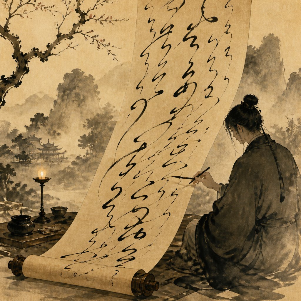
To suggest calligraphy in an AI image generator, describe the stroke mechanics: 'thick-and-thin brush strokes,' 'flowing connected script,' 'ink pooling at stroke ends,' or 'broad-edged pen lettering.' Specify the medium — 'sumi ink on rice paper' or 'gold ink on parchment' — to set tone and texture. Words like 'rhythmic,' 'gestural,' and 'controlled ink flow' push toward hand-lettered quality rather than typeset text. For ornamental traditions, add 'interlocking script' or 'illuminated lettering.' Keep any generated text abstract or illegible, since models render real script unreliably.
Frequently asked questions
What is calligraphy?
Calligraphy is the art of disciplined, expressive handwriting, shaping letters with deliberate stroke order, angle, and pressure using tools like broad-edged pens or brushes, so the writing itself becomes visual art.
What's the difference between calligraphy and hand-lettering?
Calligraphy is written continuously with a pen or brush following stroke rules; hand-lettering is drawn and built up letter by letter, often with sketching and revision, more like illustration than writing.
What tools do I need to start calligraphy?
A broad-edged dip pen or brush pen, ink, smooth paper, and a ruled guideline sheet are enough to begin. Many beginners start with a felt-tip calligraphy marker before moving to dip pens.
Which script should a beginner learn first?
A simple, evenly proportioned Western hand like italic is a common starting point — it teaches consistent angle and rhythm without the added complexity of ornate flourishes.