 Art
Art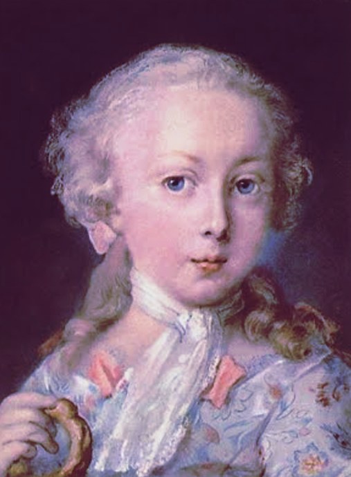
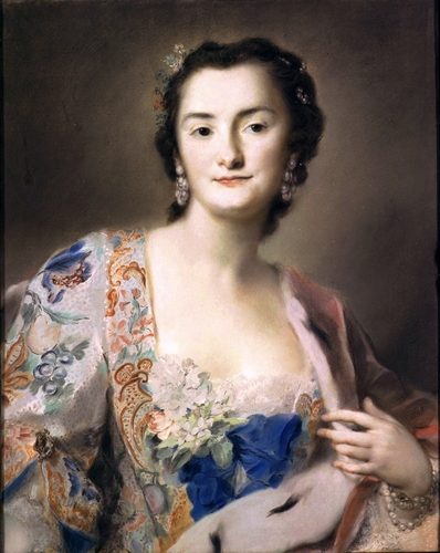
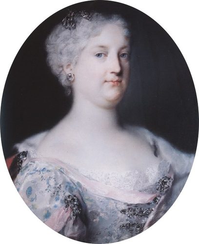
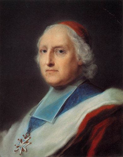
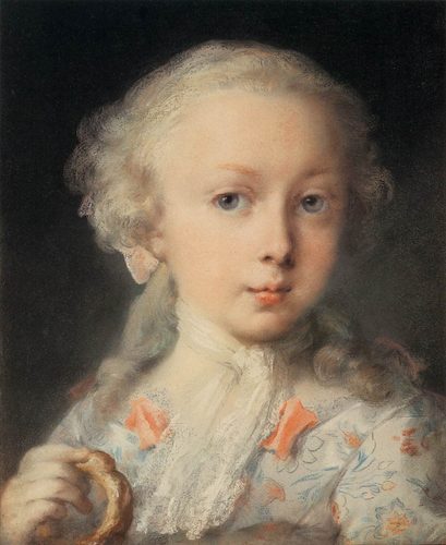
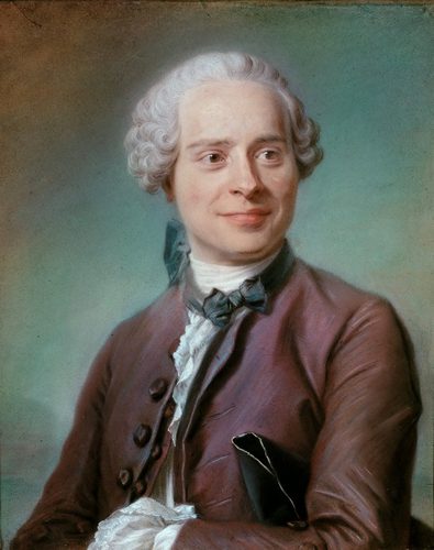
Pastel is a drawing and painting medium made of powdered pigment held together with just enough binder to form a stick, applied straight to paper with no brush, water, or oil in between. Because there's no liquid carrier to dry, dilute, or yellow over time, pastel color stays as pure and saturated as the raw pigment itself — closer to drawing with concentrated color than to painting in the usual sense.
Artists reach for pastel when they want immediacy: color goes down exactly as intense as it looks in the box, blending happens right on the paper with a finger or blending tool, and a whole passage can be reworked in seconds by pressing more pigment into the tooth of the surface. It sits in an odd middle ground between drawing and painting — capable of loose, gestural mark-making or dense, built-up color fields that rival oil paint — and its buttery texture and total lack of drying time make it especially suited to fast studies of changing light.
How to spot it
- 01Chalky, matte surface with visible individual pigment particles catching light.
- 02Soft blended gradients next to crisp, unblended strokes of raw color.
- 03Fingerprints or smudge marks left directly in the pigment.
- 04Rich, saturated color with a slightly powdery, dry-looking sheen.
- 05Visible tooth of the paper showing through thin passages of color.
The Pastel workshop card
an afternoon to enjoy, years to master layeringMaterials
- soft pastel sticks in a full tonal range
- sanded or textured pastel paper
- pastel pencils for fine detail and edges
- blending stumps, tortillons, or a bare finger
- kneaded eraser for lifting and correcting
- fixative spray for intermediate layers
- a vertical easel to let excess dust fall away
Steps
- 1
Choose a toned ground
Start on paper with color and tooth of its own rather than plain white — a mid-value gray, tan, or blue lets you work from the middle instead of building every value from scratch, and lets small gaps of the ground read as color.
- 2
Block in broad color masses
Lay in the largest shapes of local color and value first using the side of the stick, ignoring detail entirely. This underlayer sets the composition's overall temperature and value structure before any blending or refinement begins.
- 3
Layer light over dark
Apply darker, duller colors first and lighter, brighter ones on top, since soft pastel covers well but light colors struggle to show over heavy dark layers. Working this order keeps colors clean instead of muddy.
- 4
Blend selectively
Use a finger, stump, or soft brush to soften only the transitions that need it — skies, skin, distant forms — while leaving foreground texture and accents unblended. Total blending flattens a pastel piece into mush.
- 5
Work vertically and let dust fall
Keep the drawing upright on an easel so loose pastel dust falls away from the working surface instead of smearing into the piece. Tap excess dust into a tray rather than blowing or brushing it away, and work in a ventilated space — pastel dust is fine enough to inhale.
- 6
Save your brightest color for last
Reserve pure, saturated color and true white highlights for the final pass, applied with a light touch on top of everything else. These late accents are what make a pastel piece read as luminous rather than chalky.
- 7
Fix sparingly between layers
A light mist of fixative between major layers can lock in underlying color so it doesn't lift when you work over it, though every application slightly dulls color and flattens texture, so use it sparingly and only when needed.
Classic mistakes
Overblending the whole piece
Softening every stroke with a finger turns lively color into a flat, chalky haze. Leave plenty of raw, unblended strokes, especially in areas meant to feel textured or energetic.
Working light to dark
Laying bright colors down first and trying to darken over them muddies the color, since pastel doesn't cover cleanly in that direction. Build from dark and dull toward light and saturated instead.
Choosing paper with no tooth
Smooth paper can't hold enough pigment for a fully developed piece, leaving thin, patchy color no matter how many layers are applied. Use paper with real texture, especially for pieces built up in many layers.
Skipping the underlying value structure
Jumping straight to color without blocking in a clear value pattern first produces a piece that's colorful but visually flat. Establish darks, lights, and midtones early, then refine color on top of that structure.
Where it comes from
Colored chalks existed for centuries, but pastel became a serious portrait medium in eighteenth-century France and Italy, prized for capturing skin and fabric with a softness oil paint struggled to match, and for working fast without waiting on drying time. Its popularity dipped as fashions shifted toward oil, then surged again in the later nineteenth century, when a group of painters embraced pastel for its speed and its ability to render artificial light, movement, and fleeting moments — ballet rehearsals, café scenes, changing weather — in a way slower media couldn't. That period established pastel as a major exhibition medium in its own right, not merely a sketching tool, and it has remained a serious studio medium ever since.
See it done perfectly
| Work | Maker | Date | What to look at |
|---|---|---|---|
| Pastel dancers and behind-the-scenes ballet scenes | Edgar Degas | 1870s-1900s | Extensive late-career use of pastel to capture movement, artificial light, and unusual cropped angles. |
| Mother-and-child pastel portraits | Mary Cassatt | 1880s-1900s | Tender domestic scenes built from warm, closely blended color and confident line. |
| Late self-portraits in pastel | Jean-Baptiste-Siméon Chardin | 1770s | Turned to pastel late in life, prized for its directness and rich, tactile color. |
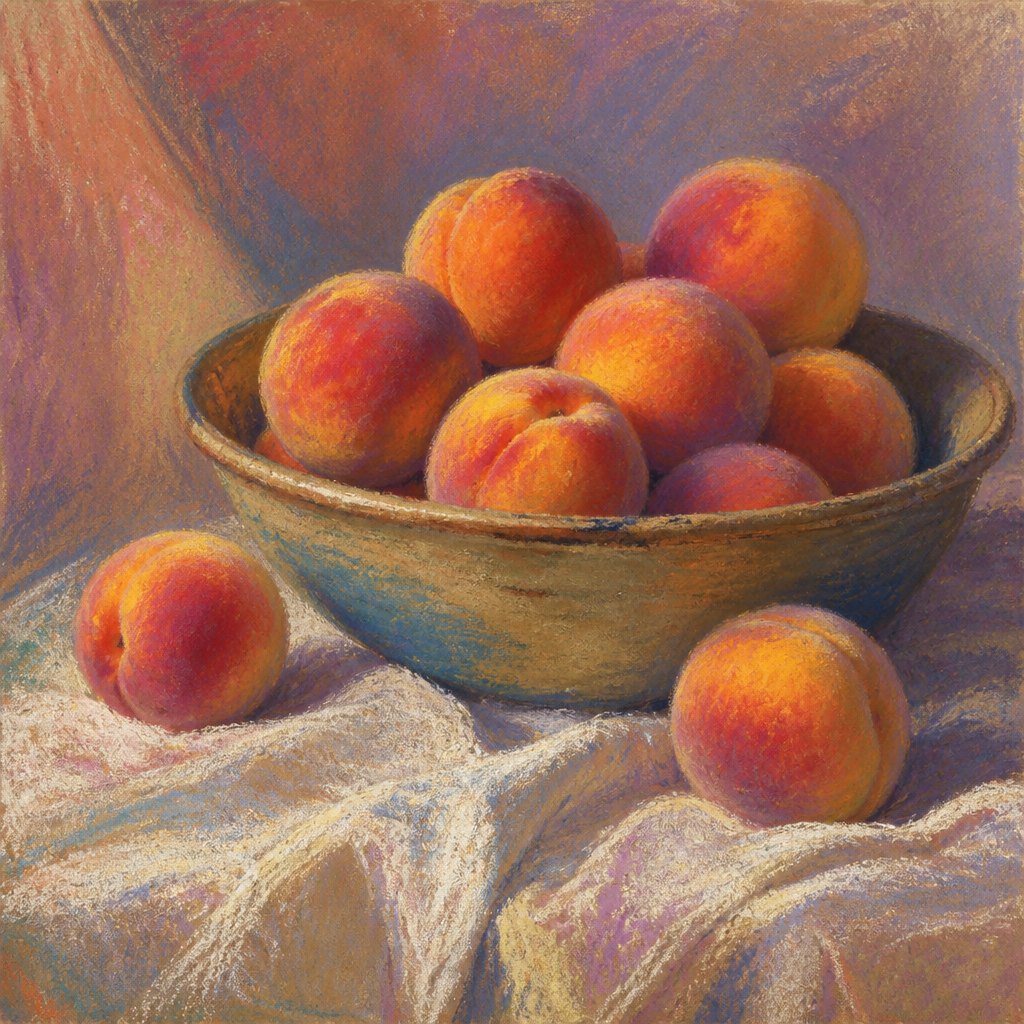 AI-generated
Try it with AI
Get the Pastel look in a generator
To capture pastel in an AI generator, use texture words like 'soft pastel painting,' 'chalky pigment,' 'velvety blended color,' and 'visible paper tooth.' Describe the color quality as 'rich, saturated, matte color' rather than glossy or wet-looking, and mention finger-blended softness alongside crisp raw strokes: 'smooth blended gradients next to visible unblended marks.' Lighting words like 'soft diffused light' or 'warm ambient glow' suit the medium well. Avoid terms like 'glossy,' 'varnished,' or 'oil sheen,' which push the image toward oil paint instead of the dry, powdery look pastel actually has.
Frequently asked questions
What is pastel painting?
Pastel painting uses sticks of powdered pigment applied directly to textured paper, blended with fingers or tools rather than a brush. Because there's no liquid medium, colors stay as saturated as the raw pigment and never yellow or crack with age.
Is pastel a drawing or a painting medium?
Both — pastel behaves like a drawing tool in the hand but can build up dense, opaque color fields that rival oil paint. Most people classify finished pastel pieces as paintings even though the tool itself is a stick, not a brush.
Can pastel paintings be damaged easily?
Yes, unfixed pastel sits loosely on the paper and can smear or shed pigment if touched, so finished work is normally framed under glass rather than varnished. Light fixative can help but slightly dulls the color.
What's the difference between soft and oil pastels?
Soft pastels are dry, chalky, and blend with fingers or dry tools; oil pastels are creamy, waxy, and blend more like paint, often with solvent or by layering. They behave, look, and feel quite differently on paper.