 Art
Art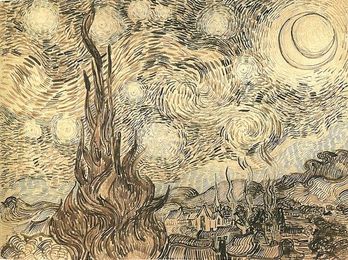
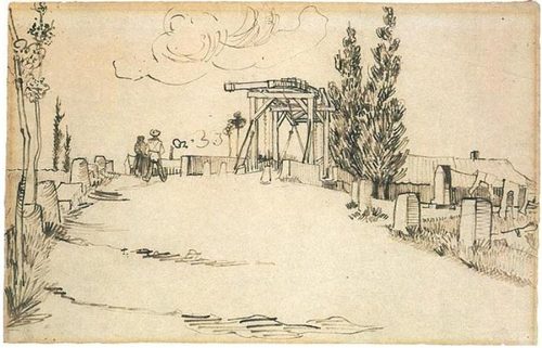
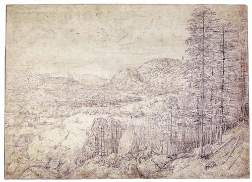
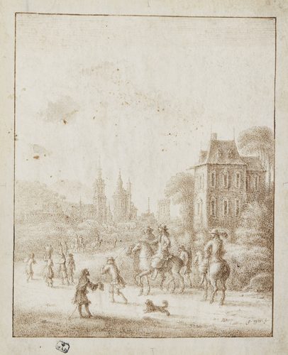
Pen and ink is a drawing technique that builds tone, texture, and form entirely out of lines, laid down with a nib, reed pen, or fine fiber-tip loaded with permanent ink. Because ink cannot be erased or blended like graphite, every mark is a commitment—darkness comes only from how tightly lines are packed together, not from smudging with a fingertip or stump.
Artists reach for pen and ink when they need crisp, reproducible line work: book illustration, botanical and scientific studies, architectural drawing, and comics all depend on it, since printing plates and photocopiers favor sharp black-and-white contrast over the soft gray range of pencil. The discipline forces planning before execution, since fixing a mistake means drawing over it rather than lifting it away. Hatching, cross-hatching, stippling, and contour line each read differently on the page, giving one simple tool a surprisingly wide vocabulary for describing light and material.
How to spot it
- 01Tone built from parallel hatching lines rather than smudged shading
- 02Cross-hatching where lines overlap at angles to deepen shadow
- 03Stippling: shadow made of thousands of tiny dots
- 04Crisp, unbroken black lines with no smudged edges or erasures
- 05Fine contour lines describing form without any gray wash
The Pen and Ink workshop card
An afternoon to learn, years to master controlMaterials
- steel-nib dip pen and holder
- reed or bamboo pen
- waterproof India ink
- smooth hot-pressed drawing paper or bristol board
- technical fineliner pens for consistent line width
- small jar of water for ink dilution
- kneaded eraser for preliminary pencil guides
Steps
- 1
Sketch a light guide
Rough in the composition with pencil so faint it barely shows, mapping proportions and major shapes before any ink touches the page. This underdrawing is a scaffold, not a finished piece—ink will follow it loosely, not trace it exactly.
- 2
Test the nib's flow
Scratch a few lines on scrap paper to gauge how much ink the nib is holding and how the paper accepts it. A dry nib skips; an overloaded one blots, so find the middle ground before committing to the real drawing.
- 3
Establish contour lines first
Ink the outer edges and major internal boundaries of each form before adding any shading. This locks in the drawing's structure and gives you a stable framework to build tone against.
- 4
Build tone with hatching
Lay parallel lines in the direction of the form to suggest shadow, spacing them tighter where the value should be darker. Keep the strokes confident and consistent rather than scratchy and uneven.
- 5
Cross-hatch the darkest passages
Layer a second set of lines at an angle to the first wherever you need the deepest shadow. Each additional layer compounds the darkness, so build up gradually rather than jumping straight to black.
- 6
Let the pencil disappear
Once the ink is completely dry, erase every trace of the pencil underdrawing. What remains should read as pure ink, with no graphite ghosting behind the lines.
- 7
Vary the line weight
Press slightly harder or use a broader nib on lines closer to the viewer or in shadow, and go finer on distant or lit edges. This variation alone can suggest depth and light without any additional shading.
Classic mistakes
Hatching in random directions
Lines scattered every which way read as scribble rather than shadow. Keep hatching strokes parallel and let their direction follow the form so the tone reads as light and volume, not clutter.
Inking before the sketch is settled
Committing ink over an unresolved pencil layout locks in proportion errors permanently. Finish adjusting the pencil underdrawing first, since ink offers no way to nudge a line over.
Overworking one area to mud
Repeated cross-hatching in the same spot can turn a shadow into a solid black blob with no texture left. Stop adding layers once the value reads correctly and move on.
Using ink that isn't waterproof
Non-waterproof ink smears if a wash or eraser ever touches it, ruining hours of linework. Waterproof, pigment-based ink is worth the extra cost for anything meant to last.
Where it comes from
Pen and ink is as old as writing itself—reed pens and iron-gall ink served scribes and illustrators for centuries before oil paint existed. It became a serious drawing medium during the Renaissance, when artists used it for quick studies and finished presentation drawings alike, prized for its permanence and precision. The technique found its widest audience in the age of print: nineteenth-century magazine and book illustration relied on pen and ink because line drawings reproduced cleanly on the era's printing presses, unlike painterly tonal work. The golden age of illustration around 1880–1920 pushed cross-hatching and stippling to virtuoso levels. Comic art and editorial cartooning carried the technique into the twentieth century, and it remains a default entry point for architects, illustrators, and tattoo artists trained in linework today.
See it done perfectly
| Work | Maker | Date | What to look at |
|---|---|---|---|
| Studies of hands and drapery | Albrecht Dürer | early 1500s | Dense, precise cross-hatching used to model form with near-engraving level control. |
| Reed-pen landscapes of Provence | Vincent van Gogh | 1888 | Reed-pen marks of dashes and swirls stand in for brushwork, describing wheat fields and cypresses. |
| Illustrations for Le Morte d'Arthur | Aubrey Beardsley | 1893–1894 | Stark black-and-white linework with flowing contour lines, made for print reproduction. |
| Reed-pen figure studies | Rembrandt | 1600s | Loose reed-pen studies capturing gesture and light with astonishing economy of line. |
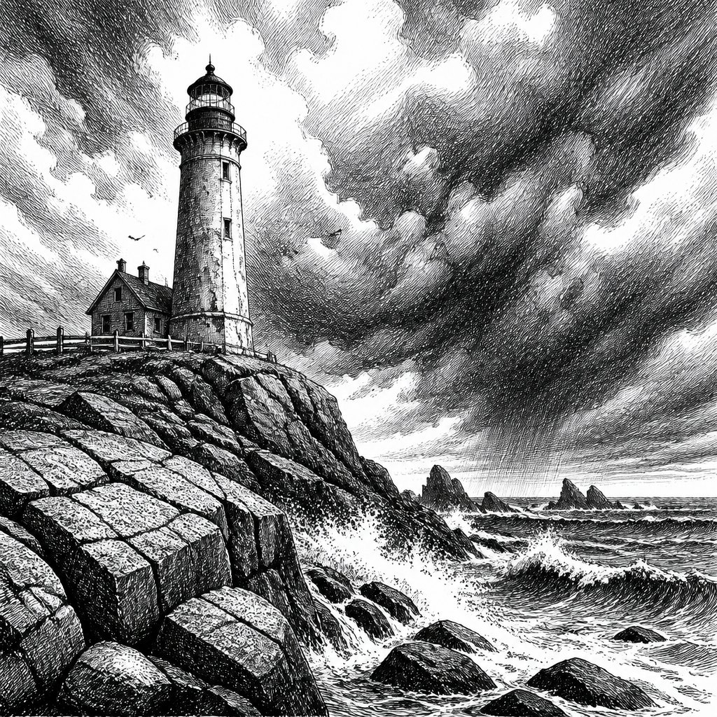 AI-generated
Try it with AI
Get the Pen and Ink look in a generator
To evoke pen and ink in an AI image generator, call out the mark-making directly: 'fine linework,' 'cross-hatching,' 'stippling,' and 'hatched shading' push a generator toward line-built tone instead of smooth digital shading. Specify 'black ink on white paper' or 'high-contrast monochrome' to avoid unwanted color bleeding in. Words like 'nib pen texture,' 'parallel line shading,' and 'engraving-style linework' sharpen the effect further. Avoid vague terms like 'sketch,' which tends to produce soft pencil textures instead of the crisp, permanent, line-only look that defines true pen and ink drawing.
Frequently asked questions
What is pen and ink?
Pen and ink is a drawing technique that builds tone and form entirely from lines made with a nib or fine pen and permanent ink, using hatching, cross-hatching, and stippling instead of smudged shading to describe light and shadow.
Can pen and ink be erased or corrected?
No—once ink hits the page it's permanent. Artists work around mistakes by adjusting the drawing around them, adding cross-hatching to absorb an errant line, or simply starting over on a fresh sheet.
What paper works best for pen and ink?
Smooth, hot-pressed paper or bristol board is ideal, since it lets a nib glide without catching on texture. Rougher, toothy papers can make fine linework feel scratchy and unpredictable.
Do I need special ink, or will any ink work?
Waterproof, pigment-based India ink is standard because it dries permanent and won't smear under a later wash. Dye-based inks are cheaper but can bleed or fade over time.